Maeflower
Identity for a sustainable Bristol-based event hire & styling brand
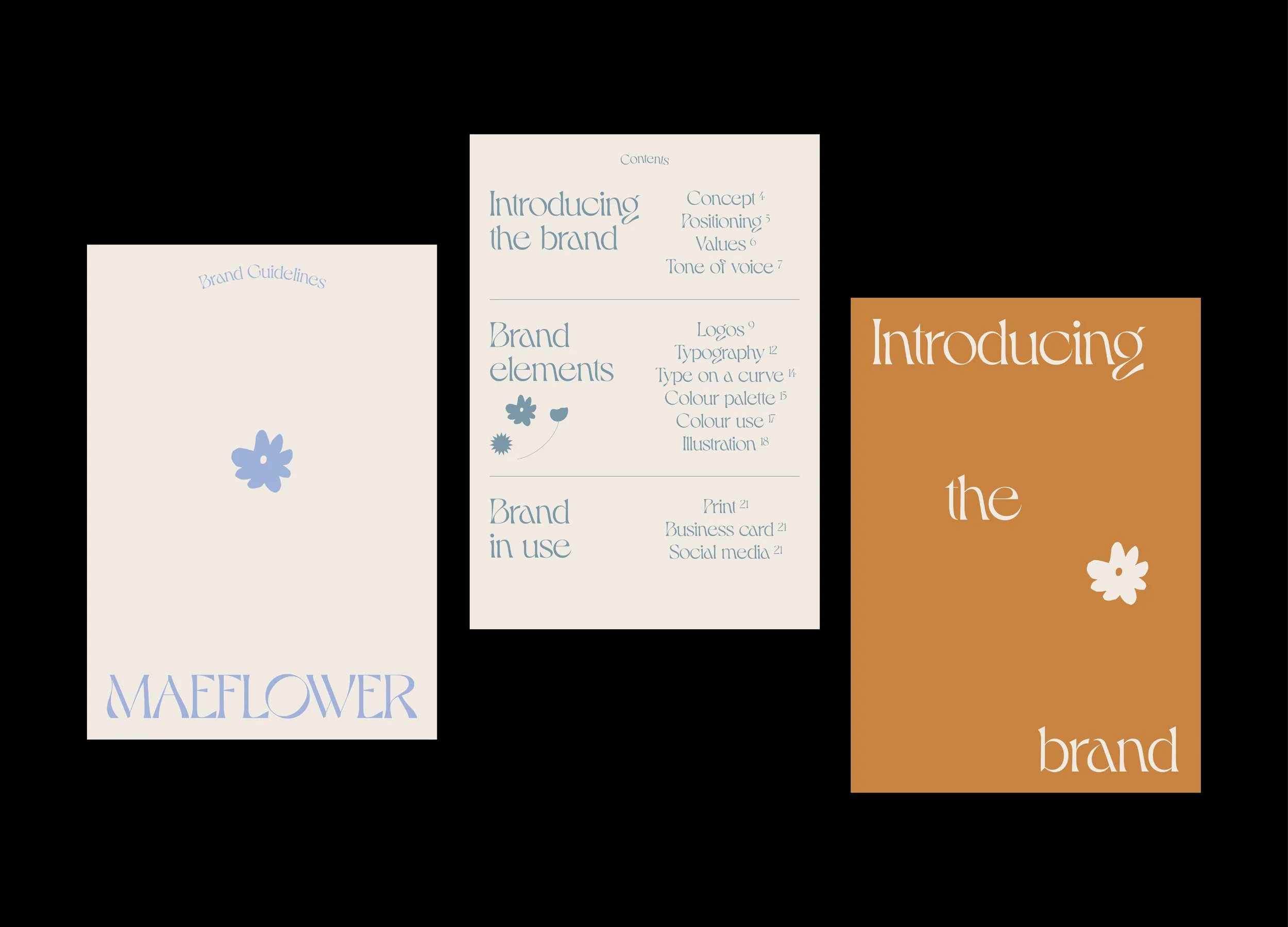
Referencing its sustainable and alternative nature, Maeflower takes its visual cues from flowers, Art Nouveau and 60s and 70s revival. The brand is designed to feel natural, calming and romantic, while avoiding being overly saccharine or embodying your usual wedding cliches. Bespoke type makes up the logo, inspired by the organic curves of Art Nouveau.
The name comes from the mayflower – a wild woodland flower symbolising welcoming, health, happiness and the month of May – the start of the high season of celebrations.